Friday, December 17, 2010
twenty-fourth blog
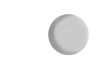
I' am still working on this. I got some help to make it a little easier and I've been working off of that. My sphere is a lot more blended than it was before and looks so much better. the little white spot is in a different layer than the rest of it because i wont have to adjust the color and it will be in the same spot.
Wednesday, December 15, 2010
twenty-third blog
This is my third time working on this project and im getting stuff done. I have added morre shadows in the sphere but they need to be lighter. I hope I can get a little more time on this because I would really like to make it look good.
Monday, December 13, 2010
twenty-second blog
This is my second time working on my sphere. It doesn't look like much but there are somethings there. Since my last one you can kinda see that it's thicker and blurred.
Thursday, December 9, 2010
Twentyfirst blog
This is my latest project called sphere. This is only the beginning but I plan on making it the way it is supposed to look.Right now I am doing my shading and trying to get the brightest part and the whitest part to be seen. Once I do that I will have to actually make the shadow of the sphere sitting on a table or something in that variety.
Tuesday, December 7, 2010
20th blog
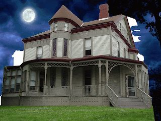
I think I have pretty musch finished this. I know it looks really dark but it's still kinda creepy. Of you look into thr front window you can see I added a little something extra.
Friday, December 3, 2010
Nineteenth blog/ Spider-doo
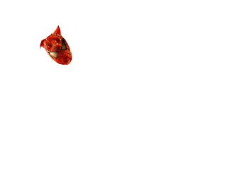
I have been a little off task to day but I am still getting stuff done. If you look closely at the picture you will see that I have changed the Man in Spider- man do doo so it will read Spider-Doo. This took up most of my class period but My haunted house is still getting there. All I have to do for this picture is make the mask so it will match Scooby's head on Spidy's body.
Wednesday, December 1, 2010
statue of liberty
I have just fixed my statue of liberty and made more of the blue dissapere. I rounded out the tips of the crown but if I rounded them out more they would be very short and I didn't want that to happen. I hope this is good enough to get my grade up.
Monday, November 29, 2010
eighteenth blog
So far I have made another layer with my door on it you can really see the door now but I do plan on Darkening it up and scaling it into the right spot. I did darken the picture a little but I think I might have darkened it a little to much. My grass still looks very animated and I am also still trying to fix that up, so the main thing here is that I need to fixen up most of theses things I have on the picture.
Monday, November 22, 2010
seventeenth blog
I have officaly fit in my grass. It is kinda deformed and I am still working on that but besides that it looks pretty good. I plan on making my grass and house darker to fit the scene because right now it looks very animated and fake.My sky is already darker and I'm not sure why it is showing it lighter on here because it's not.
rhino zebra
This is as far as I could get my zebra rhino and I didn't want it to be turned in late. I think I did a pretty good job on it but I'm not exactly sure. I know it looks pretty bad but at least I got the shape.
Thursday, November 18, 2010
sixteenth blog
This is Thursday and it's my sixteenth blog. I had some grass but then it kinda stated to mess up so I deleted that layer. I have darkened my sky and house to make it look a little more creepier. I should have my grass by my next blog and I will be darkening that also. I do have some other layers full of broken windows but I wont put those up until my grass is there and my house looks better.
Tuesday, November 16, 2010
my fonts
These are my fonts I have just finished them way after they were suppose to be done. There are ten of them of all in different colors some of them I came up with the words others are the name of the words for example Mickey and Minnie mouse,and fairy dust the others are names from me. I feel so much happier now that i have gotten these in and I hope that in help my grade.
Friday, November 12, 2010
fifteenth blog
Still the same kinda but a little different. If you look by the far left you will notice that the windows shades have been taking out and it doesn't look like there are any. I warp this a little making the sky go under the house so it didn't look as fake. It still kinda does look fake but I'm getting there just need some patience.
Wednesday, November 10, 2010
fourteenth blog
I have decided to change my background for my haunted house to something darker. I have already started trying to form it to the house to make it look at least be a little realistic. You can tell that it looks kinda like a green screen background but I'm still working on it a little.
Monday, November 8, 2010
thirteenth blog
This is the picture of my background for my haunted house. I picked it because it looks like the sun is setting and the darkness is moving in. Its going to be tricky trying to get the sky of this picture as the sky of the other background and making sure there is no pattern.
Dog project
I really removed the stuff in the sky well but were the light post was I didn't really do that good of a job. If you look closely you can tell were the pattern is. I wish I could do it better but I didn't really have a lot of time.
Car removal Project
I'm sorry it took so long to get this but I finally got it. If you look closley you can tell were the shadow starts and stops exactly but I couldnt find any other way to change it. I got rid of everything out of the sky very nicley. It should look pretty good.
twelth blog
I am still working on my Spider-Doo but i am also trying to accomplish my haunted house. As you can see I have already cut out my sky it was already dark, but not dark enough. After I add my dark sky I will start getting rid of my grass and make that creepy too.
Tuesday, November 2, 2010
eleventh blog
This is a picture of the head of Scooby-Doo and the mask of Spider-man.I am working on trying to put the head and mask together to make them seem like that's the orginal charachter.
Wednesday, October 20, 2010
tenth blog
I have to started working on changing the color of of scooby's face and trying to make it the color of spider-man's suit. I'm not done adjusting it completely to make it match the color of the suit but I am almost there. I'm not sure if I will finish in time when everybody else is finished but I hope I do or else it will be just like the car project.
Monday, October 18, 2010
ninth blog
These are cutouts of scooby's head and spider-man's mask. First I have to color scoobys head with red and it needs to be a mask that kinda matches the color of spider-man's suit. When I am finished doing that I will have to move the mask and the head together to make scooby's head match the out line of spider-man's mask. This will take a while but when I'm finished with that I need to move the lines and the eye covers to match up with that shape of scooby's head.
Thursday, October 14, 2010
eigth blog
I've gotten a little farther on this. The head is rotated and enlarged to fit the picture. I have to do some more warping and liquefying to make it right and then I will try to add the colors to make scooby look like the real thing.
Tuesday, October 12, 2010
seventh blog
This is called spider-doo and it's my newest project. Im not sure how this one will turn out I just think the hardest part will be trying to change the color of scooby-doo's head into the color of spider-man's.
Monday, October 11, 2010
My 5 pictures
I like this picture and find it interesting because the way the flower sits there makes it seem like it's looking out of the window almost wishing it could go be out in the open instead of having to sit in the darnk coldness.
To me this picture seems interseting because it reminds me of a cartoon and how all of the fruits and vegetables are the big guys that are there to help you out to find your way ect.
This flower almost seems real when you look int the middle of it and the way the blue and white peices blend in to make it seem real intruiges me into the shot.
I love the way the camera got the rose to glow across the black backround, and since there is a glowing and a black backround it makes the middle of the rose shine and brighten.
The way the wood reflects the belft of flower petals makes the shot seem simple but delicate at the same time(that may be just me) but I really find it complicated of how I could get the shot that way.
Friday, October 8, 2010
sixth blog
Not much has really been done. If u close enough you might be able to see that the flag is gone. I'm still not exactly sure how I will get the sky and grass a different color but i will find it out. I think once im done this will end up being really good.
Wednesday, October 6, 2010
fifth blog
Right now I am on my fifth blog and this one is about making this house creepy. The picture is 1600 by 1200. I'm not exactly sure how this will turn out but hopefully it becomes really good.I think the house looks kinda creepy originally but I can make it creeper than it already is.
Monday, October 4, 2010
fourth blog
This photo is one of the toughest photos I've been working on so far. It was difficult for me to put the layers together and at least try to even them out. After I put the layer on there as you can see I am trying to make the size of each of them match. Hopefully this will be done soon!
Thursday, September 30, 2010
3rd blog
I have just finished this picture. I found this one the easiest because I only needed to use one toot for the whole thing and there was a large amount of flat space. i missed some of the blue spots but everytime I go back to fix them they don't show up. This picture so far has been my fastest, easiest, and i'm glad i could get it done.
Thursday, September 23, 2010
my second blog
I am working on this picture of the Statue of Liberty. What i am trying to accomplish is to try and take the blue sky out. As you can see i have already gotten most of the blue around the crown gone. This might be difficult and it mgiht not be were just gunna have to find out for oursleves.
Tuesday, September 21, 2010
First Blog
This is my first blog!
This is a picture of my computer graphics teachers dog. I find this picture complicated because it's almost as if every piece of this picture is different in multiple ways. The reasons I like the picture is because it looks like it was taken by a real photographer.
This is a picture of my computer graphics teachers dog. I find this picture complicated because it's almost as if every piece of this picture is different in multiple ways. The reasons I like the picture is because it looks like it was taken by a real photographer.
Subscribe to:
Posts (Atom)


